Role
Industry
Duration

With the goal of increasing our conversion rate, I conducted a drop-off analysis across the checkout funnel. The results confirmed a direct link between the number of checkout pages and user friction, review reservation page was experiencing a 40% drop off rate.
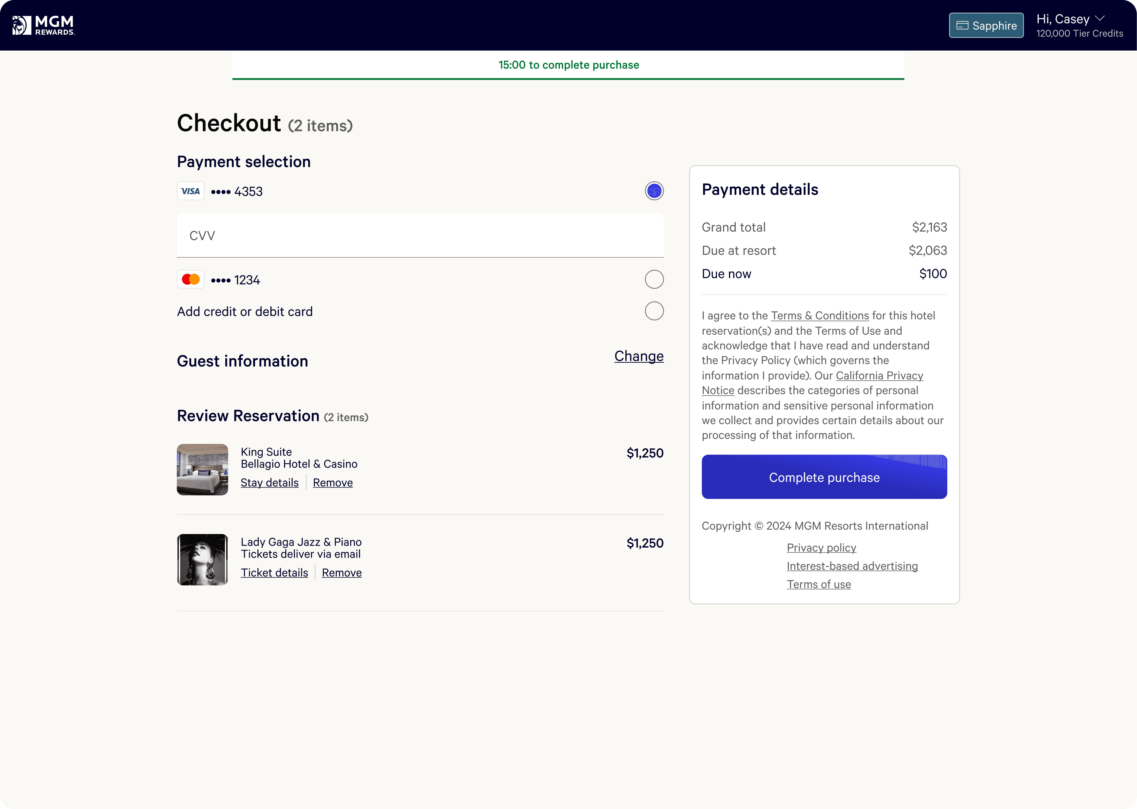
The current booking flow shows prices without resort fees, adding them only on the Review page, which surprises users and leads to drop-off
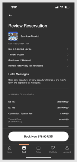
Reviewing the total cost and entering payment information occur on 2 separate pages, introducing friction and increasing the likelihood of abandonment.

I led the visual design and strategy for the product configuration flow and checkout experience:
Crafting the E2E flows, including PDPs, cart, review, payments, confirmation and e-mails.
Manage the design system updates and setting new patterns for multiple squads
Conduct data analysis using clarity.
Collaborating with PMs, risk, compliance, and engineering.
Customers have come to expect faster, frictionless checkouts. Amazon—which already pioneered a streamlined flow—took it a step further with one-click purchasing for logged-in users to eliminate friction entirely.



Baymard Institute
Nielsen Norman Group
Uxcel
Reduce the friction and number of steps needed to complete booking
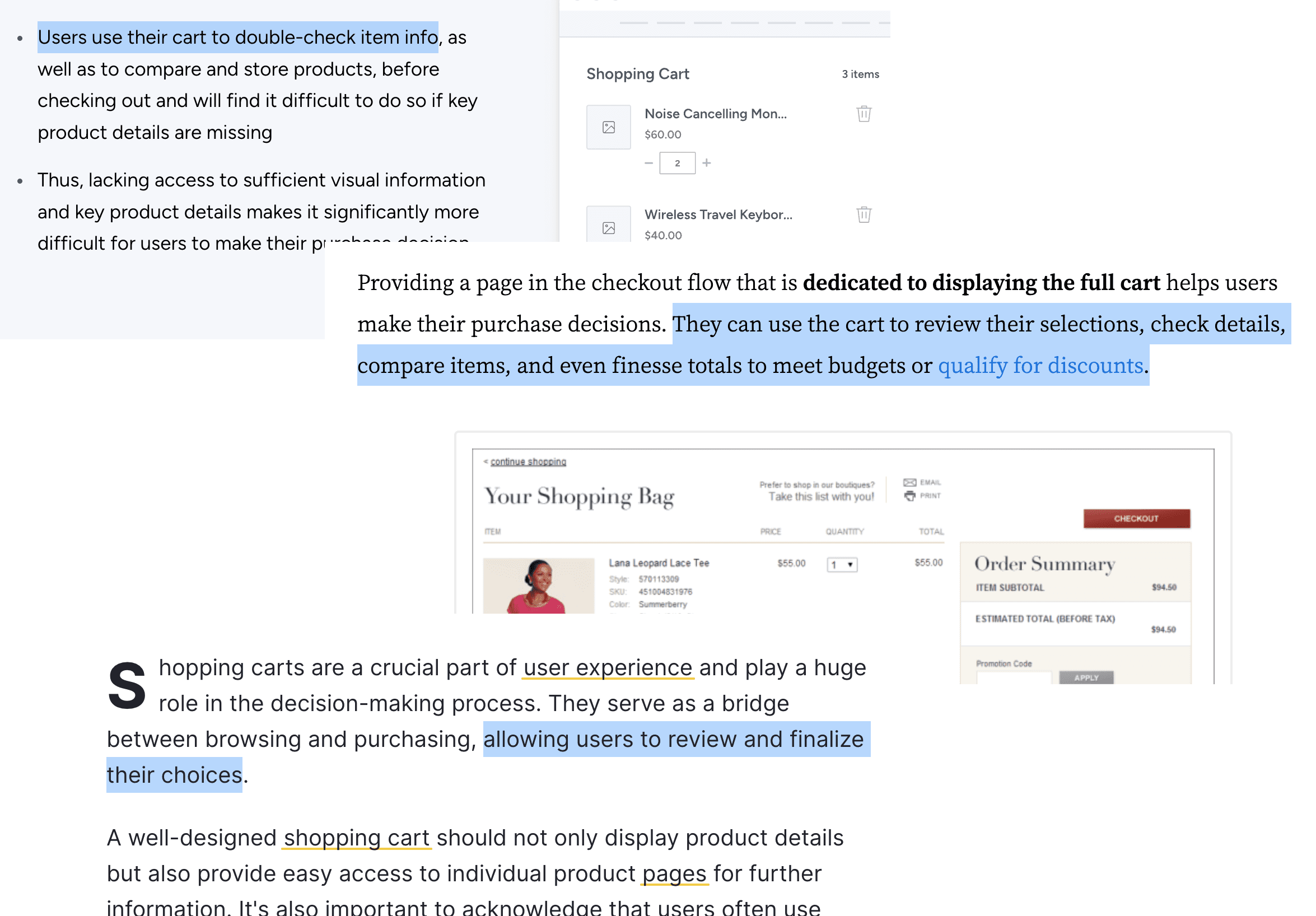
Maintain user context with selections, pricing, and payment options, especially with wallet integration, merging the two pages will benefit returning users by providing an even quicker and smoother experience
Reduce engineering efforts for maintenance and minimize the potential for errors
Optimize the information architecture of the page to reduce cognitive load when parsing price details
Adopt best practices and align with modernized checkout flows
Drop offs and conversion rate
NP Score

Discovery
At beginning of the project we used claude to run benchmark analysis and Claude Cowork to automate the research output from the interviews and user testings based on our research plan and interview script, which made the whole process way faster, because without the AI we would need to finish the discovery process and only them analyses the data and consolidate the outputs, with claude the output and insights were updating in real-time while we were on the discovery process.
Execution
Claude Design was used to run multiple layout options for the same features and validate them with quick prototypes. After we had a consolidated UI design Claude Code allowed me to prototype directly inside our staging environment, shipping functional code rather than static Figma frames. This meant complex interactions could be tested in the browser before engineering build started. By committing production-ready component code locally, design handoff shifted became a faster process.
Unifying pages
Now the user can review, edit, add trip enhancements and pay directly in only one page.